
From Newsletter to North Star:
Building a Brand Framework for Allendale Public Schools
An updated newsletter and a way to take the brand forward.
The Challenge
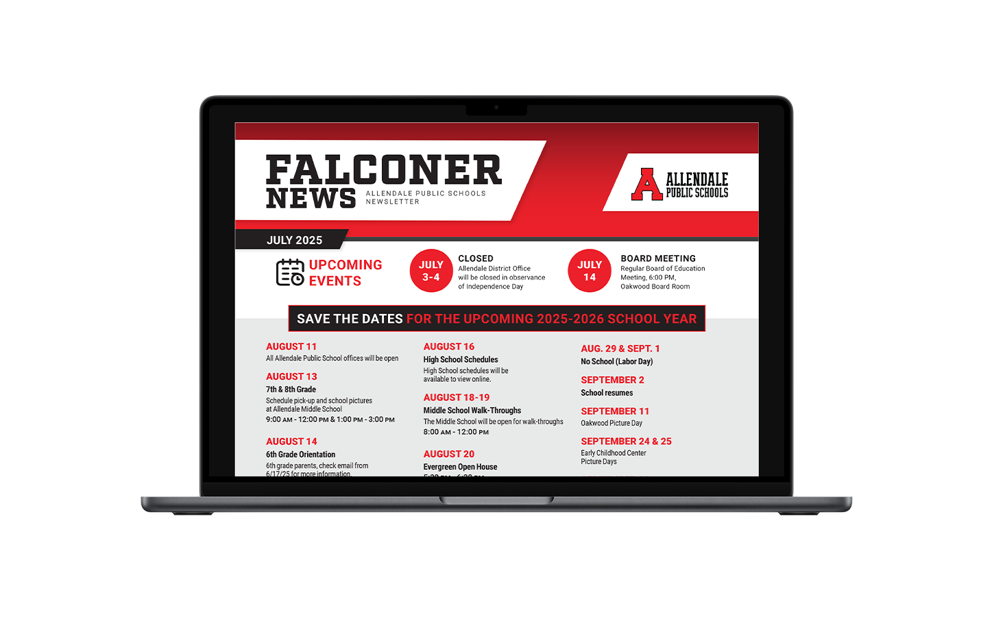
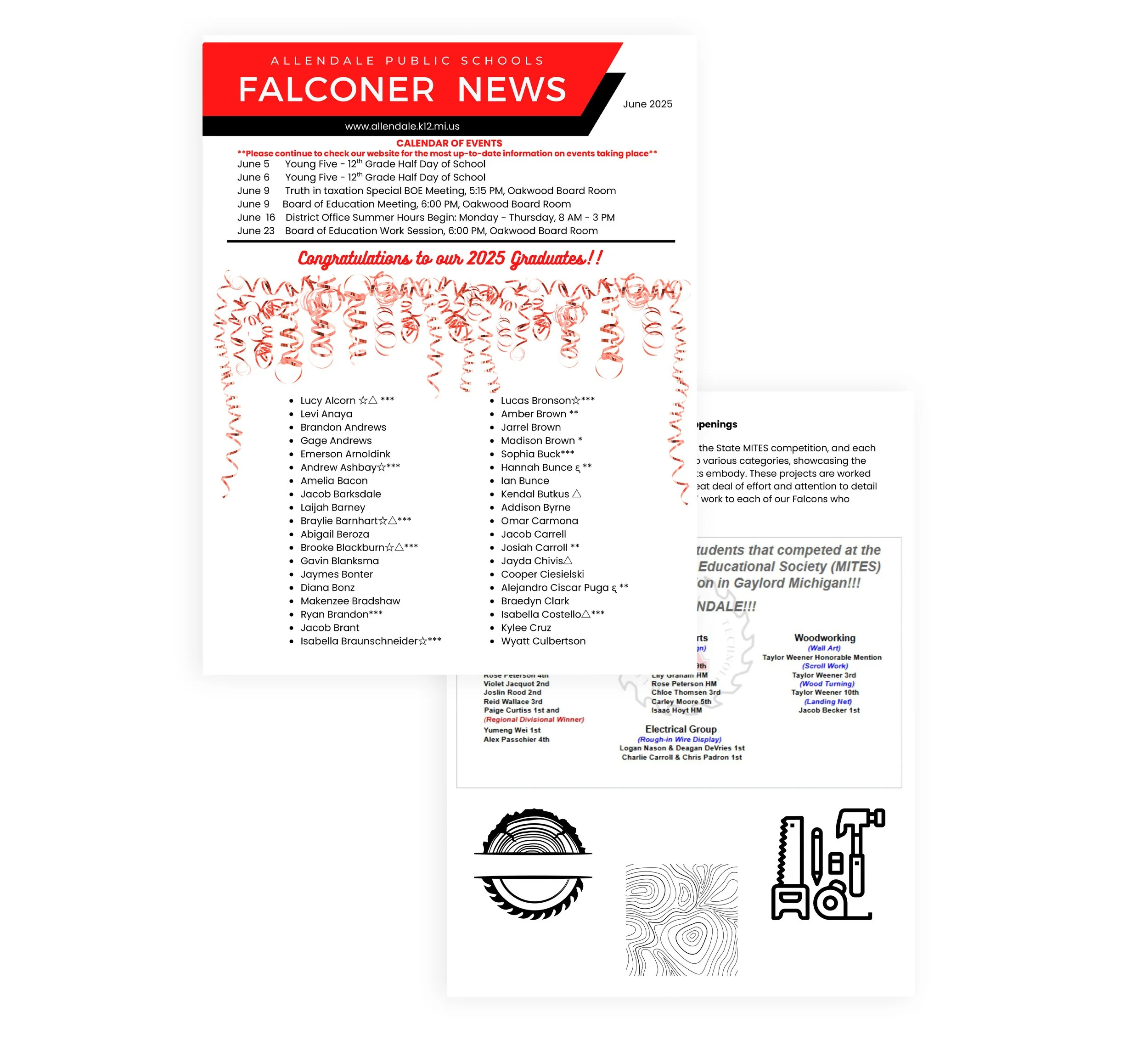
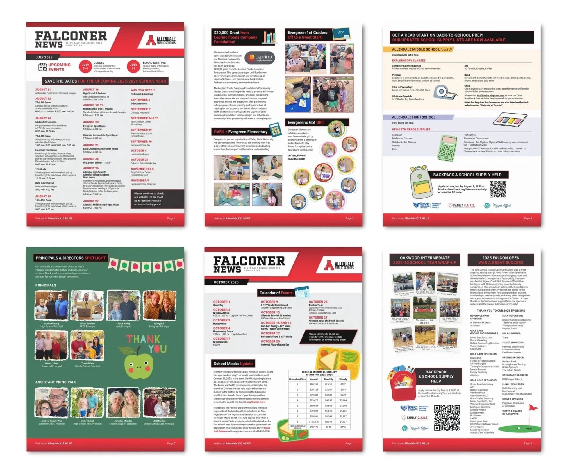
The district's brand identity was applied inconsistently across schools and departments, with no clear guidelines for logos, colors, typography, or graphic elements. The Falconer, the APS district monthly newsletter, a key touchpoint for families and the community, presented an opportunity to establish a stronger and more recognizable presence.
The brand needed cohesion across all communications. Our main objective was to redesign the monthly newsletter. We aimed to strengthen brand recognition and create materials families would instantly recognize as distinctly APS.
The Goal
The Approach
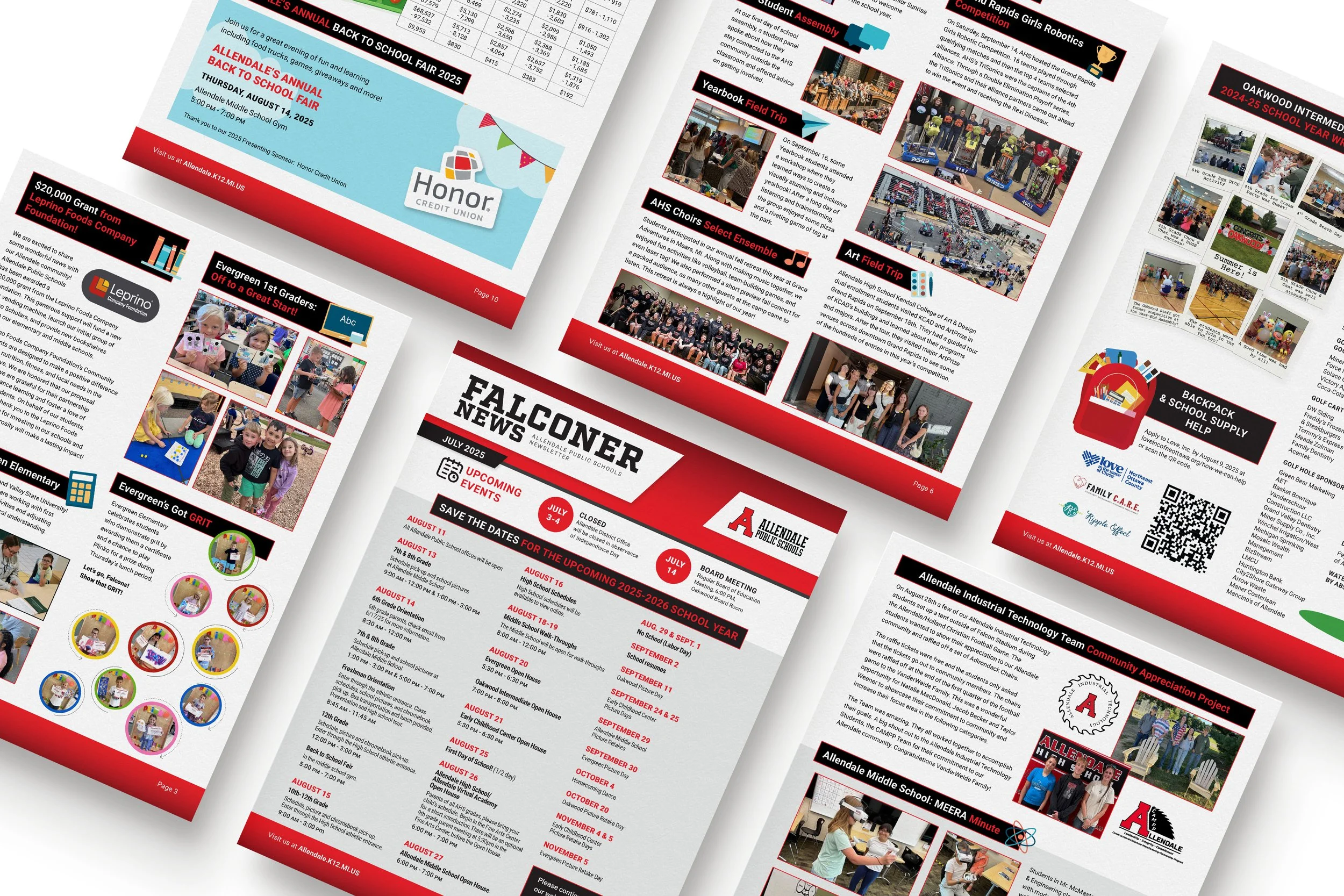
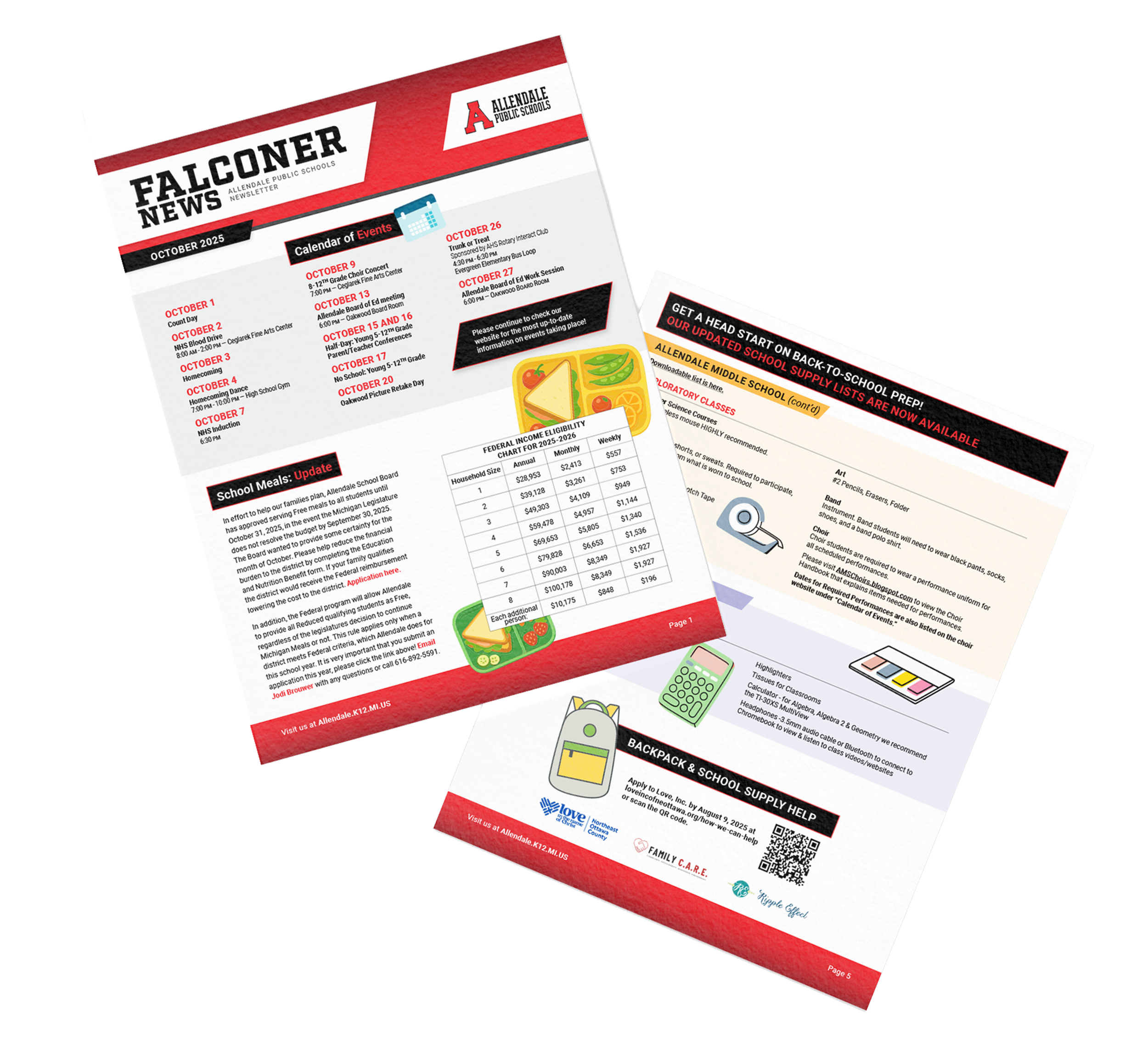
We developed a cohesive brand system rooted in APS's existing assets—their bold red, the strong "A" logo, and the Falcon identity. We established consistent typography, a minimal color palette, and dynamic graphic elements like angled bars and geometric shapes. Applying this system to the newsletter, we transformed it into a clean, scannable, visually striking communication tool.
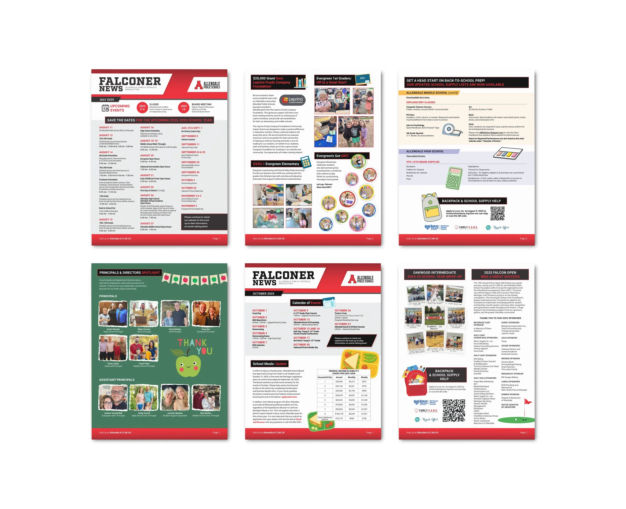
Each iteration refined the brand and built a library of templates and patterns. The process culminated in a comprehensive brand guide documenting logos, typography, colors, graphics, and photography standards in turn giving APS a roadmap for consistency
The Results
The redesigned newsletter serves as a strong example of Allendale Public Schools' visual identity. APS now also has a brand framework and clear guidelines to create consistent communications across all schools and departments. The brand guide provides structure and clarity, strengthening the district's overall image.